
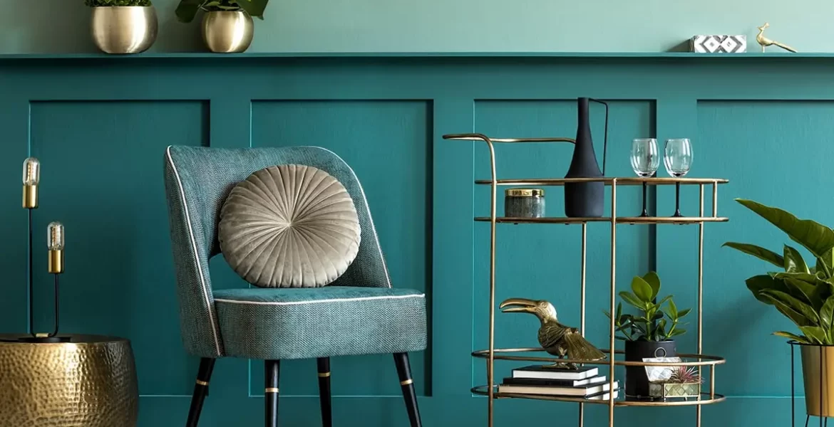
Each color has a character. It will set the atmosphere of the room, affect your mood. Therefore, the choice of palette must be approached responsibly.
What colors to choose
First ask yourself what kind of mood and in what room you want to create. For example, the bedroom needs a cozy and calm atmosphere. It is better to decorate the office in those colors that set you up for fruitful work. In the living room, it is good to use shades that help to relax and unwind.
White
Often used for wall decoration in the living room, study or bedroom. It visually expands the space, and therefore is perfect for small apartments. White color helps to think clearly, encourages creativity, and sets you up well for a working mood.
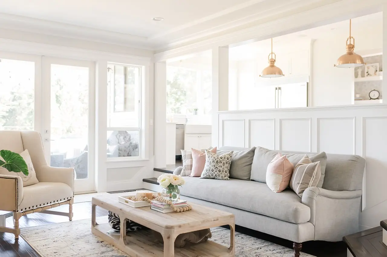
- white, grey, beige;
- white, beige, yellow;
- white, pink, beige.
Grey
It emphasizes other colors with its neutrality. It can be used in any room. Light gray shades are good for the bedroom, but dark gray will ideally set you up for a working mood. True, you should not choose gray-gray as the main one: it is very depressing, associated with sadness.
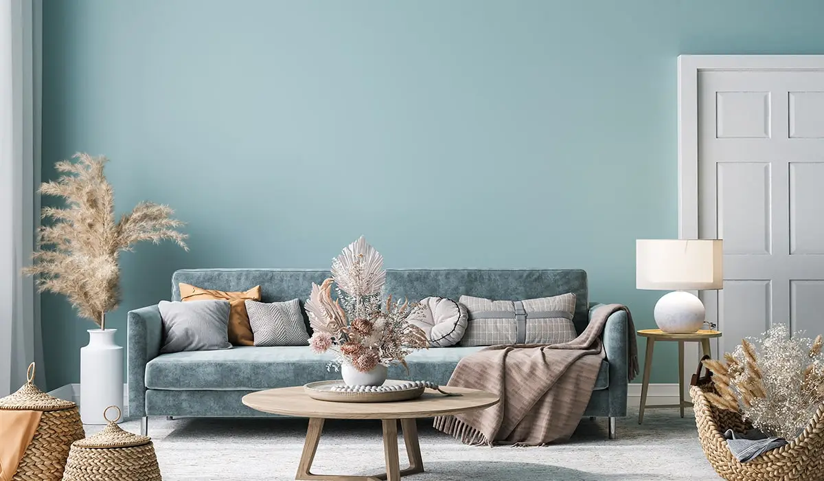
Good combinations:
- grey, white, beige;
- grey, white, pink;
- grey, blue, brown.
Green
One of the most winning colors. First, it evokes positive emotions and relaxes. Secondly, for each room there is a shade. It is better to use light green in the bedroom, olive or bright green in the office, and light green, gray-green or muted dark green will look good in the living room.
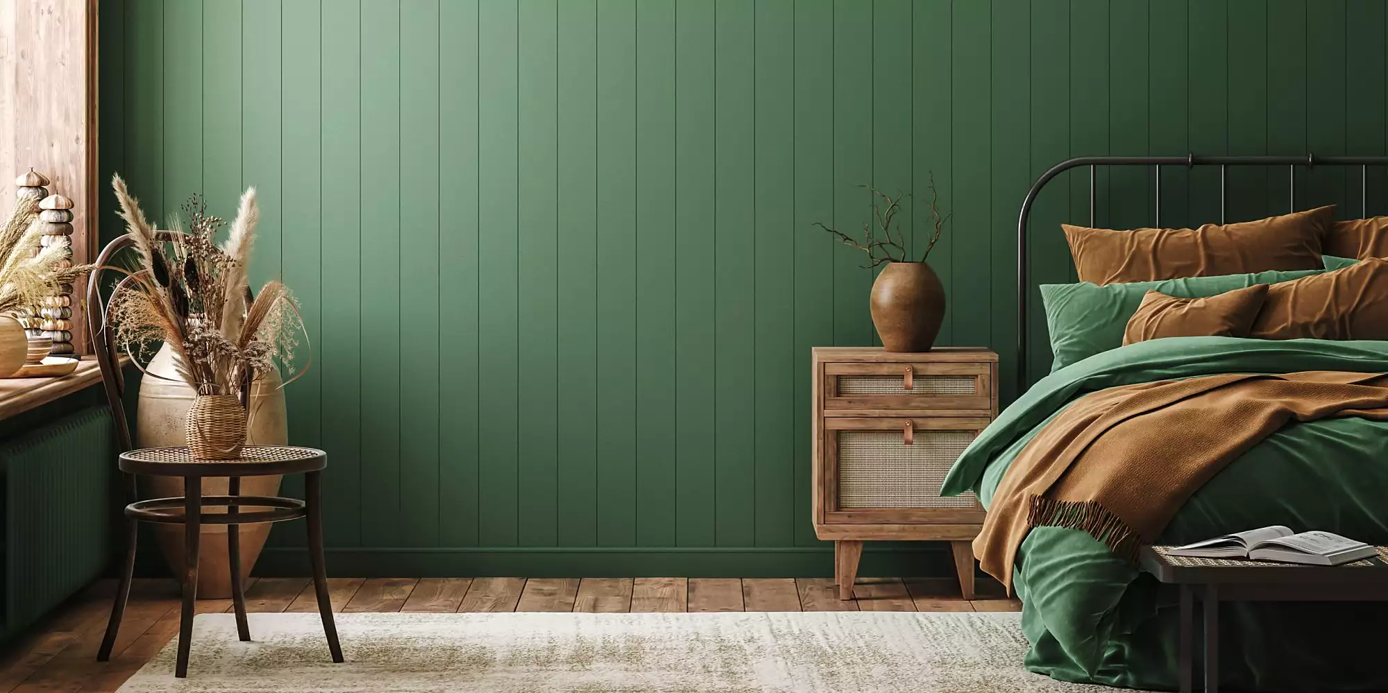
- green, white, beige;
- olive, gray, brown;
- green, brown, dark red.
Yellow
The perfect color for decorating a child’s room. In other cases, yellow should be used carefully. This color is very joyful and bright, so the interior may turn out to be too saturated. A good option is a light yellow color, which is successfully used to decorate bedrooms and living rooms.
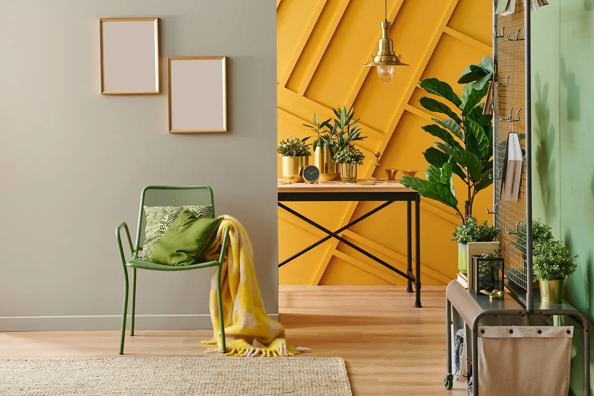
- yellow, white, gray;
- yellow, orange, green;
- yellow, white, brown.
Violet
Vivid purple is the choice of originals. But even if you are not particularly prone to non-standard interiors, you should definitely consider choosing purple as the main one. It is the color of rest and recuperation. Light purple (lavender) is the best choice for a bedroom or bathroom. Bright purple will look good in a nursery. Dark purple will create the right atmosphere in the living room.
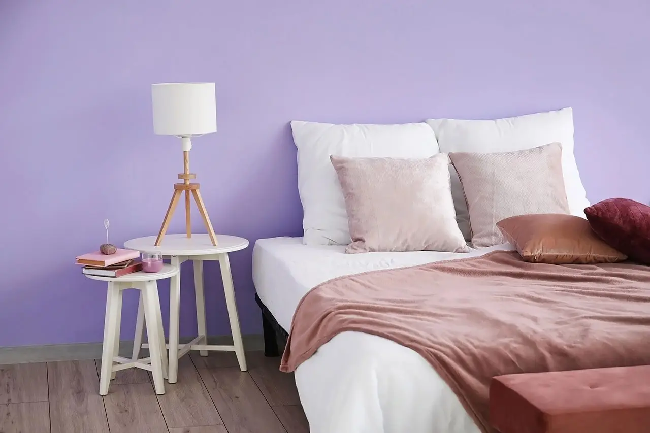
- light purple, white, beige;
- purple, white, pink;
- purple, gray, brown.
Red
It is better not to use this color as the main one. It will irritate the eyes, create an atmosphere of tension and stress. But if you really like red, use its shades. For example, wine, terracotta or muted burgundy.
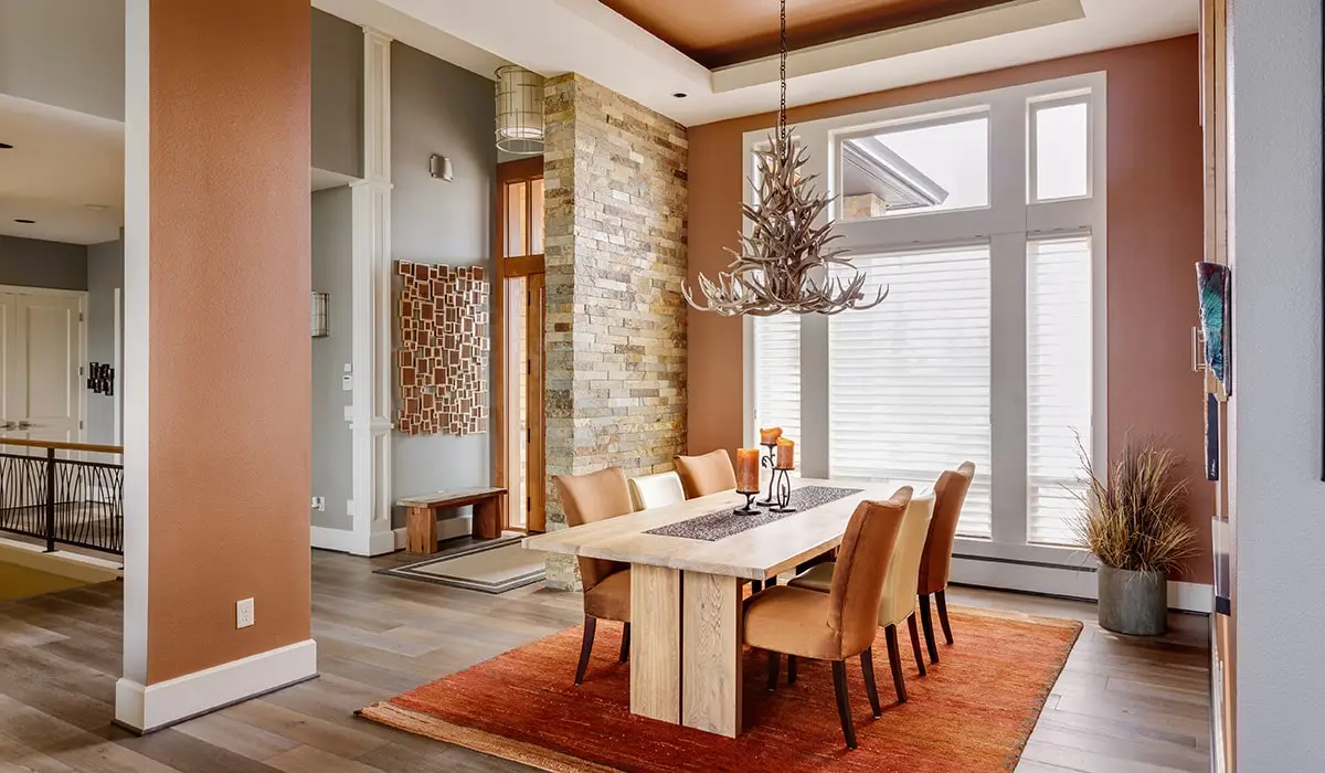
- red, white, black;
- red, gray, brown;
- terracotta, light gray, beige.
Black
Black color is considered too gloomy, but this is not entirely true. After all, it makes the room stylish and respectable. Black is a beautiful and complex color that can and should be used in the interior. It will come in handy even in the nursery, if you choose a special coating for drawing with chalk on the walls.
It is better that the black is matte and does not shine in the light. You need to emphasize it with shades of gray, contrasting colors or textures like wood and metal.
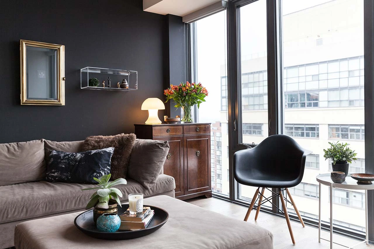
- black, white, brown (wood);
- black, beige, gray;
- black, gray, yellow;
- black, grey, purple.
How to match colors
Whatever shades you choose, in order to harmoniously combine them, you need to learn one simple rule. It’s called 60-30-10.
- The main color is used in 60% of the interior. This means that most of the walls and furniture are given to him.
- Auxiliary color – 30% of the interior. Perhaps it is in this color that the ceiling should be painted.
- Accent color – 10% of the interior. This shade needs to be used in detail. You can paint a wall in it or find a small but very bright rug.
Everyone can create a stylish interior in harmonious colors. The main thing is to understand what kind of atmosphere you need and what colors you like, and remember the 60-30-10 rule. If you are not confident in your abilities as a designer, use the ready-made combinations suggested in the article.